CASE STUDY
attitudent
Starting with a naming and a logo design, attitudent became a strong brand since 2017. This is an example of how a small clinic with ambitious and hard working people can grow to a well established dental clinic. The visual identity wouldn't be nothing without the quality of the services and the attitude towards good dental health. Having hundreds of five stars review tells us how much care and dedication is involved.
Visual Identity Design, Document Design, Print Design, Illustrations, Various Graphic Design Materials

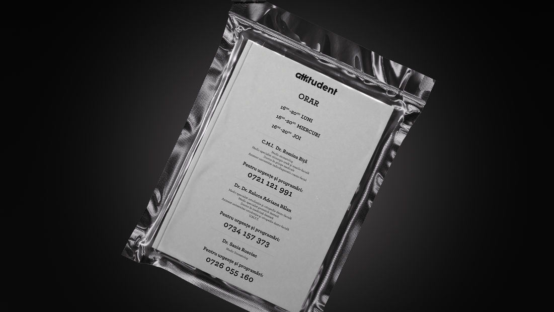
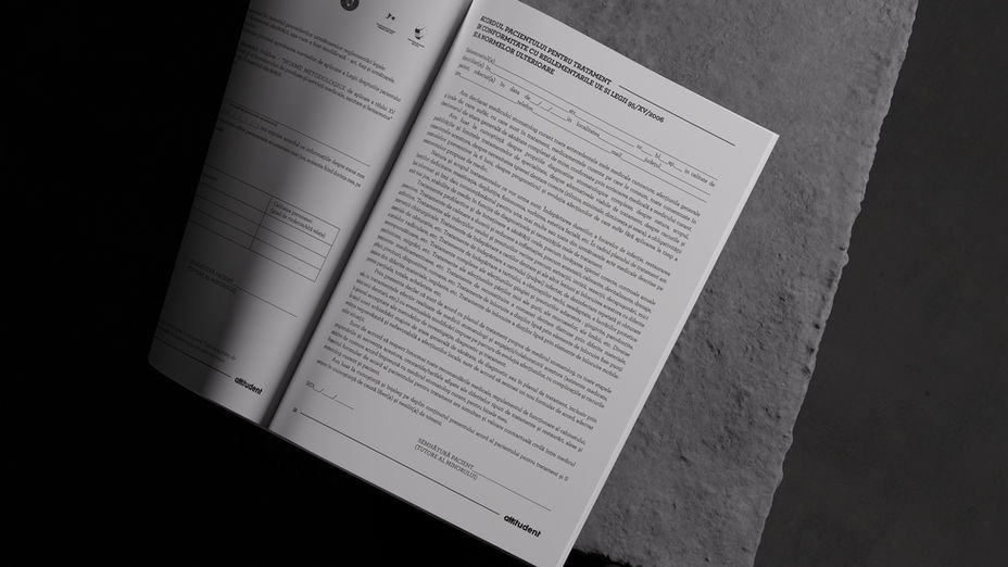
I started with naming after which I developed a logo and an art direction. One of the few customers who specifically requested handmade work from me, has proudly showcased several of my drawings on the walls inside their clinic. I worked mainly with charcoal pen and textured paper but also with pastel and paint markers. One of the biggest challenge was to redesign the documents and brand them. Starting with stationery design we moved to branded treatment plans, price lists, appointment tickets, patient information and a lot of other documents.
This project also involved collaboration with local artist who did ceramic bowls in the shape of teeth and other decorative materials, local companies who 3d printed the logo for display and the actual print of the documents on different types of papers and textures. All this has been done consistently over the past six years and is still ongoing with the most recent plan to take the business online with a website.
Attitudent name was also adopted by the dental technician clinic which was branded under the name of attitudelab. Project which involved also document redesign, print design and quite a few hand painted works to decorate the walls.


