To Be or not to BeFIT? 'Tis but a case study, M’lord.
- Cajvanean C. Alexandru

- Jun 1
- 7 min read
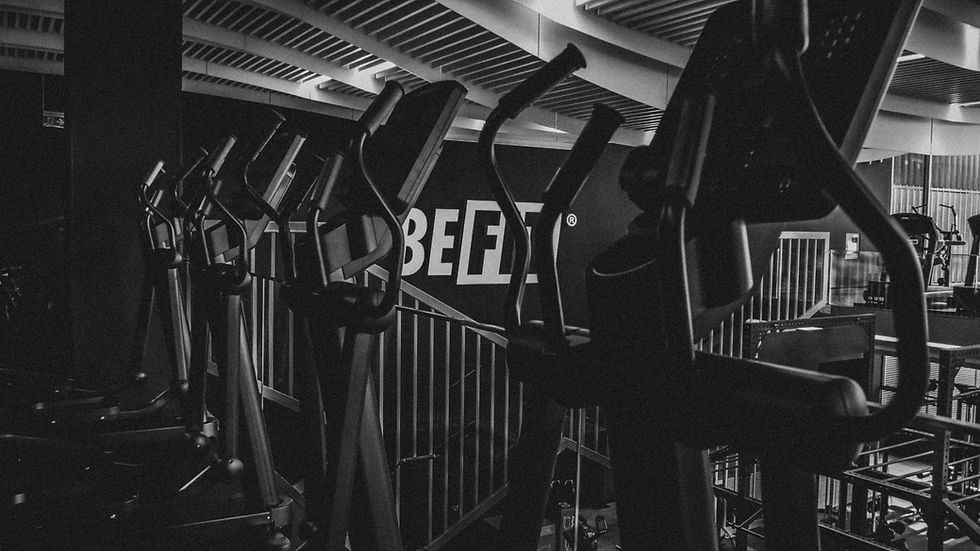
BeFit is meant to be a place for everyone, no matter the fitness level. In fact, it aims to make wellness accessible to all. Leaning towards the younger audience, fresh, tech-savvy and well-informed, these gyms set themselves as a high-value proposition that is budget-friendly and close to home locations. These are ultra-modern facilities with facial recognition scanners, state of the art air filtering systems, top-shelf weightlifting equipment, cardio zones, boxing zones, Hyrox-style areas and equipment, and so much more.

What I delivered
Being a new brand operating at a large scale, the graphic design had to feel timeless, relevant, and highly appealing, not only to a young audience but to the general public as well.
For the BeFit project, I delivered a comprehensive visual identity that includes logo, colour palette, typography, illustrations, grid systems and layouts, accessibility icons and signage, art direction, and various graphic elements. All of this was documented in an 90+ page visual identity manual so the brand can grow and keep it consistent. I also created the website, which meant the user interface, visual style, and various UI elements. I designed the initial launch version, and a different agency later rebuilt it and took on the social media work. Credit where credit is due.


The starting point: type, clarity, scale
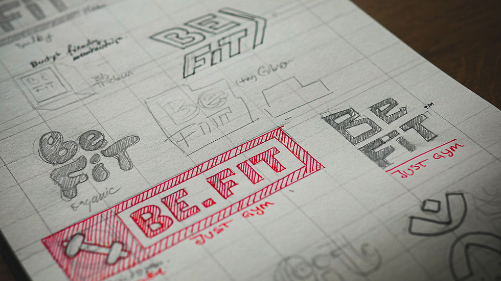
I started the process by exploring typography that conveys the idea of sport, freshness, youth, modernity, and clarity. Why do I say clarity? I do believe that clarity had to be the main concern due to the fact that this was built to scale for a large audience. So clarity in design means accessibility and ease of use: clear hierarchy, clean signage, high-legibility, easy-to-scan type and colorblind friendly via high colour contrast. Not only that, the memorability factor of a logo largely depends on public approval. So, it had to be . . . functional, utilitarian, simple and usable, communicative and honest because the audience was so large.
I don't know why, but it feels familiar
One more important aspect that I also kept in mind was that a brand with multiple locations had to feel familiar, especially if it was launched yesterday. Familiarity builds trust on day one and creates a safe space to come back to. Thinking about these and going through a series of wordmaps, different pictorial concepts, and all sorts of styling got me to the conclusion that, for such a short, memorable name, I would want to stick with the typography. A solid font family(Futura) that is used in the fitness industry is the exact rhetorical argument that would convey to the audience “what seems to be true”. It is, in a way, persuasion via culturally shared beliefs. I get ahead of myself here, but this is what I believe when I mean that intuition of the viewer or the user comes from these exact principles.
In spite of how solid a concept may be, the logos, colours, and typefaces have to appeal to your audience's sense of what feels “credible”, “familiar” or “right”. This is the “semiotic weight” you may hear every so often in a design-related discussion.
Design with intention
This all may sound more sophisticated than it actually is, but this is designed with intention. And intention is exactly what you need when you are creating with a specific set of values in mind. It’s not me; this is ancient knowledge that goes back to Aristotle. If you want to win an argument with an audience, you must use what the audience knows. You see it in all fields, especially used by high class business men, leaders and lawyers. It applies to design when you try to persuade using specific visual language, and that means to establish credibility, to connect emotionally and to provide clear reasoning. Ethos, pathos, logo.
You show just enough so your audience can relate and understand, which makes the visual language feel true, then let the audience fill the gaps.

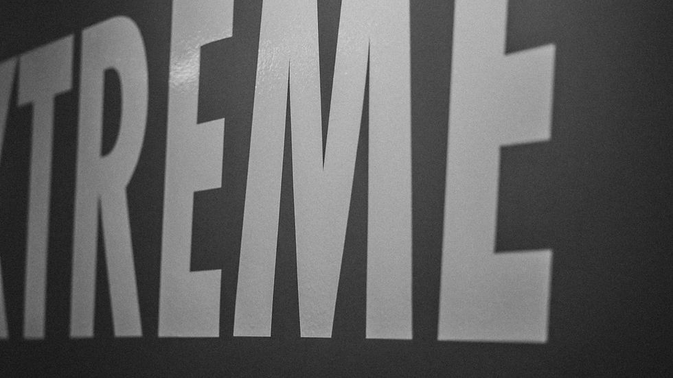
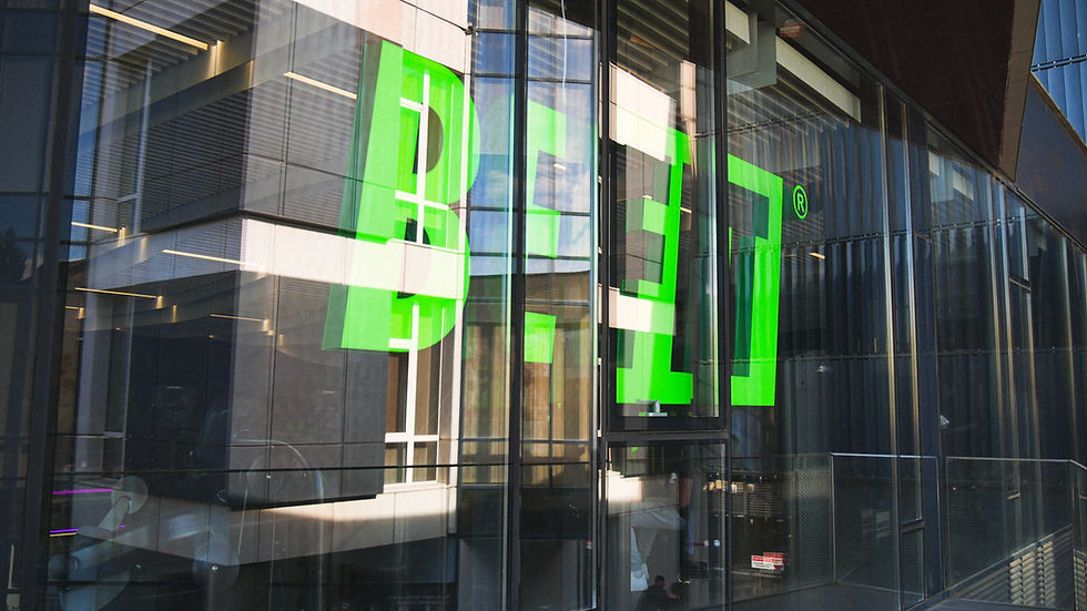
The BeFit logo
The wordmark is built in two parts, Be and Fit, with the second part framed as the focal point. The logo speaks BeFit, it conveys action and result at the same time. The Be is out of the box; it is free, because the man is free to be. FIT is boxed, just as you would highlight a word in your manual with that Sharpie. You can be FIT and maintain it, or you can “Become” FIT. The viewer asks himself: to be or not to be FIT?
The type has the italic style that puts the letters slightly at an angle. When is a man at an angle? When he is doing something, or is getting ready to do something, or is in the middle of an action. He is either running or falling, or doing anything but being static. The letters are ready to go, italic type implies movement. See how, through design, we are intentionally shaping how ideas are received? The audience doesn’t do this analysis, but it understands it instinctively.

Bold italic type is nothing new or original in the fitness industry. In fact, it is the exact argument that makes this logo relevant to the audience. This being a case study, I am allowed to go deep to prove this applied logic to design that, from the outside, feels obvious, or feels that it is how it should be.
A visual identity is not a logo. Now, a visual identity is not a logo, and I won’t stop this BeFIT case study here. In fact, there is a 90+ page visual identity manual to prove it. I’ll keep the focus on the parts that carry the vibe in public: colour, type, and illustration.

The color
The main colour, called “Acid Green,” is a youthful, vibrant tone of green that is distinct from any other large fitness brand, and this is one of the main differentiating factors when it comes to the visual language. Besides black and white, we have a tertiary colour that is meant to complement the green, and it is used for the female illustrations in order to create a more colourful and diverse environment in the gym, but also to show that there are some gym spots that are female-dominated, like the BeBooty areea
In this system, green is used as a call-to-action which guides the user's attention through signage, buttons, pricing and highlights. Black and white is there for clarity, as we mentioned in the beginning, a large audience, a simple to understand design, and that leaves the green in charge for the consistency of the visual hierarchy. This shade of green is very saturated, almost neon-like, and that makes it a quick identifier. Given enough time, people will spot the brand even without a logo.
Inside the gyms, the main colours are black, dark grays and white; therefore, green is used in signage, helping the members to orient quickly. I tested the contrast, and the green remains legible on black, especially in small UI text, but does not perform well on white, which is not a problem because the white is used only with black and for the text mainly. I defined colour specs and usage rules across digital, print and interior applications to keep the palette consistent across multiple locations and suppliers.


More type
No surprise here, using bold and italic type with motivational quotes creates a feeling of movement and using the same font family for large messages on the gym walls pushes the idea of familiarity. These large-type compositions are designed to create a structure of meaning while also maintaining visual consistency for the brand by incorporating the same elements of the logo.
Unlike the logo, which has strict rules when it comes to usage, these typographic elements are more open for versatile use due to differences in gym layouts and spaces. They still have to use the brand colours and the font, but they have more freedom in usage. For example, you can decorate an entire black wall with black type, making use of the different textures to create a beautiful space.


Illustrations
In the past, gyms used to have posters with different bodybuilder superstars, and that is because these gyms were a place for those who were passionate about bodybuilding, mainly. In the present, going to the gym is seen more as a healthcare activity that has flourished well in the age of self-development and individuality. Using images of actual people can create political tensions due to controversial figures and unrealistic body standards. Confucius said, “If language is not in accordance with the truth of things, affairs cannot be carried on to success.” So our language of movement and roughness through these illustrations is meant to create an impulse for the workout that takes place in these gyms.
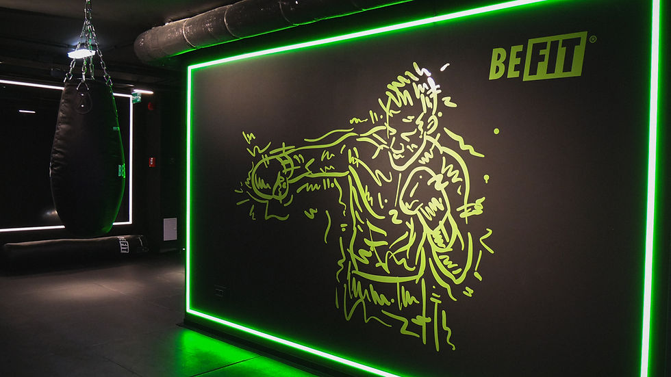
I hand-drew a series of characters in different gym poses. These illustrations are meant to be drawn on the rush as the person posing for the artist is actively moving, so the artist just traces fast lines to capture the action. Again, a lot of emphasis on movement, movement in type, movement in color and now in illustration. This brand has to feel very much alive, just like the gyms and the people inside of them. Alive means healthy and in full activity.
As you can see, the illustrations have multiple lines as if the artist(me, lol) is trying to define the person that works out and in the process creates a lot of movement, mistakes and dynamics. They are versatile enough to be used as prints, as wall decorations inside the gyms or as graphic assets for social media posts, banners and everything else that could be brand-related.


Everything links to everything
Now, as you can see, everything is pretty tight and strict, and each component of the visual identity is meant to link to all the other elements and through that, the purpose is to create visual consistency, clear communication and an atemporal characteristic of the brand. It can live past trends without feeling dated in a few years.
You can see how even simple decisions for a fitness brand like BeFIT have an entire decision-making process behind some seemingly simple graphics. What at first may seem like just a wordmark and some sketches goes through a filter of design thinking before establishing purpose. Good design doesn’t mean overly developed. It means the things that are created instinctively still have a good argument and a clear reason to exist. And when they do, they become part of an entire strategy to bring a good service to a broad audience.

I'm Cajva, a graphic designer from Timișoara, Romania. I work on logos, brand identities, illustrations and I hand-draw everything I make. If you enjoyed this article, there's more where that came from, and if you ever need a designer, you know where to find me.

